

A prospect at a trade show booth will forget a URL within the hour. They won't necessarily forget the brochure they stuck in their bag, especially if it's heavy enough to notice and designed well enough to be worth a second look on the plane home. That's not nostalgia for print. It's a fairly specific claim about where a physical brochure still does something a PDF, a landing page or a follow-up email genuinely can't.
The Trade Show Floor Is Still a Physical Place
Digital has taken over most of the marketing funnel, but a conference floor, a sales meeting or a retail counter are still physical spaces where a conversation happens in real time and something needs to change hands at the end of it. A QR code printed on a banner asks for an action (pull out a phone, scan, wait for a page to load) at exactly the moment a prospect's attention is already divided between the booth, the crowd, and the next conversation they're planning to have. A brochure asks for nothing. It gets handed over, it goes in a bag, and it's still there later, at a point when the prospect actually has time to look at it properly.
That's the real function of a leave-behind: it isn't meant to close anything on the spot. It's meant to survive the gap between a five-minute booth conversation and whatever decision-making process happens back at the prospect's desk, days or weeks later, when the details of the conversation itself have mostly faded but the printed piece is still sitting where they put it.
A Brochure Outlasts a Browser Tab
A PDF attachment gets one moment of attention, if it gets opened at all, and then it's buried in a downloads folder or an inbox thread among a hundred other unread messages. A brochure left on a desk gets a fundamentally different kind of persistence. It's a physical object taking up physical space, which means it gets glanced at again while someone's looking for something else, or picked up by a colleague walking past who was never part of the original email thread at all.
That secondary exposure (the colleague who picks it up, the second glance a week later) is something a closed browser tab structurally can't provide. Digital content is only ever one click from disappearing entirely; print stays exactly where it was put until someone actively decides to throw it away, which is a much higher bar than simply not clicking on something again.
What Paper Stock and Fold Say Before Anyone Reads a Word
A brochure communicates positioning through touch before the reader processes a single line of copy. A thin, flimsy sheet reads as low-effort regardless of how good the design on it is; a heavier, uncoated or soft-touch stock reads as considered and premium almost automatically, because that physical weight is doing work no screen can replicate. The same is true of finish. A glossy coating signals vibrancy and energy, while a matte finish tends to read as more restrained and upscale, and the choice between them should track the brand's actual positioning rather than being picked on print cost alone.
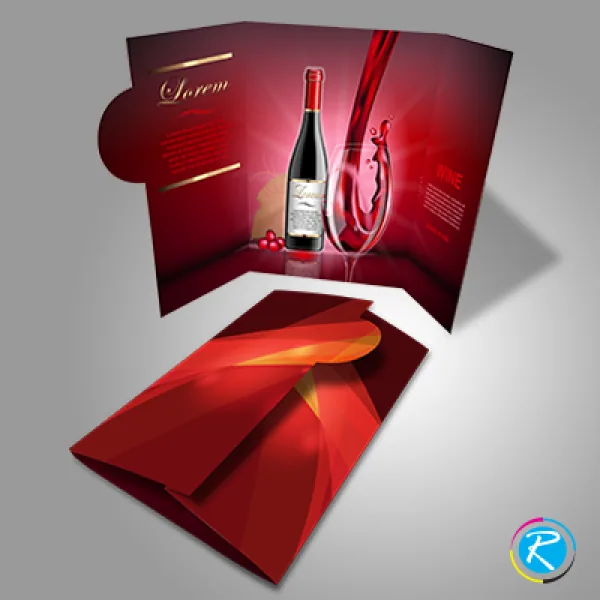
Fold format matters just as much as stock. A simple bi-fold suits a short, direct message. A single offer or a service overview that doesn't need much room to breathe. A tri-fold spreads the same content across more panels, useful for a step-by-step explanation or a small product lineup where each panel can carry its own section. A gate fold, opening from both sides toward a central reveal, is built for a bigger visual moment. The kind of unveiling effect that works well for a flagship product or a single striking image a brand wants front and center. None of these are interchangeable; picking the fold that matches how much content actually needs to be told, rather than defaulting to whichever format looks most common, is what keeps a brochure from feeling either cramped or padded with filler. Our custom brochures cover the bi-fold and tri-fold end of that range, while our large brochures handle bigger, gate-fold formats.

What Paper Weight Actually Means in Practice
Paper weight numbers are notoriously unintuitive. The same brochure could reasonably be described in pounds or in grams per square meter, depending on the printer's convention, and neither number means much without a comparison point. A standard sheet of office paper sits around 20 pounds; a brochure printed on that stock would feel flimsy and cheap almost immediately. Most professional brochures start well above that, in a range that has real, noticeable heft and resists creasing or curling at the edges after a few days in a bag or a folder. Moving up from there into heavier cover-weight stock is where a brochure starts to feel closer to a small book than a flyer. Appropriate for a flagship piece meant to be kept, less necessary for something handed out by the hundred at a single event.
Coating adds another variable on top of weight. An uncoated stock has a natural, slightly textured feel that many brands now prefer specifically because it reads as more considered than a glossy finish. It also takes handwritten notes well, which matters if a brochure is meant to double as something a prospect annotates during a conversation. A coated stock protects the print from fingerprints and wear over repeated handling, which matters more for a piece expected to survive weeks in someone's bag rather than a single afternoon.
When Print Genuinely Wins
None of this is an argument that print replaces digital. For most top-of-funnel discovery, a webpage or a targeted ad is doing a job print was never good at. But there are specific moments where a brochure outperforms its digital equivalents, not as a matter of taste but of circumstance: in-person sales conversations, where a rep can physically point to a spec sheet or a comparison chart while talking, doing something a shared screen rarely replicates as naturally; trade show floors and events, where connectivity is unreliable and attention spans are shorter than a page-load time; and any moment that calls for a genuine parting gesture. Something a prospect can hold onto that signals the conversation mattered enough to leave something behind, rather than a promise to "send more information" that quietly never gets opened.
Planning Print Runs Around How a Brochure Will Actually Be Used
How a brochure will be distributed should shape the order quantity as much as it shapes the design. A piece meant to be handed out by the hundred at a single trade show has a different cost-per-unit tolerance than a smaller run of a premium leave-behind meant for a handful of high-value sales conversations. Printing the trade-show volume on the same heavy, premium stock as the boutique piece usually isn't a good use of budget, since the audience receiving it won't spend enough time with any single copy to notice the difference in stock weight the way a one-on-one prospect would.
Turnaround time is worth building into the planning calendar the same way it would be for any other print order. A brochure with a folded structure, spot coating or a less common paper stock generally takes longer to produce than a simple flat flyer, and ordering with a date already circled on the calendar, rather than realizing the trade show is in ten days, is what keeps a print order from becoming a rushed, compromised version of what was actually planned.
Choosing Print for the Right Reason
A brochure earns its cost back when it's used for what it's actually good at: physical persistence, tactile signaling of quality, and serving as a tangible artifact of a real conversation. Matching the stock, finish and fold to the brand and the message (rather than defaulting to the cheapest option available) is what separates a brochure that gets kept from one that gets left on a table when the booth closes for the day. Browse the full brochures range for stock and fold options before specifying a run.


