Free design proof on every custom order: no templates, no stock SKUs
Five formats. Weight and surface do almost all the work here. A card is judged in the hand within about a second, before anyone reads a word of it. Filter by whether you want the standard rectangle or something that breaks it.

3.5″ × 2″, any stock and finish. It has to fit every wallet, every time.

Square, shaped or die-cut. The rectangle is the thing you want to break.

Center score, four panels. Contact details are not the only content.
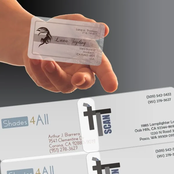
Rigid PVC, waterproof. It has to survive a wallet or a worksite.

Frosted semi-transparent PVC. The card itself should be the talking point.
The standard 3.5 x 2 exists because it fits every wallet and card case without anyone thinking about it, and a card that gets carried beats a card that gets admired and left behind. If you want to stand out, spend it on stock weight, finish and edge treatment rather than on a shape people cannot file. 16pt is the point where a card stops feeling like a flyer; soft-touch is the finish people comment on unprompted.
The alternatives each buy something specific. A center fold gives four panels instead of two, which is worth it only if you can name what the extra space is for. Plastic and translucent stocks survive a wallet indefinitely and read closer to a payment card than to print. A shaped or square card is the most distinctive and the least likely to be carried, which is the right trade at an event and the wrong one for a card meant to be found next month.